
Conversion-focused web design builds a website around one job: getting visitors to take the action your business needs, whether that is a phone call, a booked appointment, a quote request or a purchase. Looks still matter, but every layout, headline, button and form earns its place by moving a visitor toward that action. For a local service business, this is often the difference between a site that looks good and a site that fills the calendar.
TL;DR
- A conversion-focused website puts the business goal first and arranges layout, copy and calls to action so visitors can complete it with little effort.
- Give every page one goal, one primary action, and a clear label on the button that says exactly what happens next.
- Mobile speed, short forms and visible trust signals (reviews, credentials, security cues) remove the friction that costs you leads.
- Measure first, then test: set up conversion tracking, watch real user behavior, change one thing at a time and judge results with enough data.
- Local businesses get the most from pairing a conversion-built site with traffic from Google Ads, local SEO and fast lead follow-up.
Table of Contents
- What conversion-focused web design means
- Why it matters to your business
- Seven principles that turn visitors into leads
- Layout, navigation and calls to action
- Mobile usability, speed and trust signals
- What B2B and high-consideration sites need
- Measure first, then test
- A practical checklist for your next site or redesign
- Our perspective
- Put it to work with a Smart Website
- FAQ
- Sources
What conversion-focused web design means
A conversion is any action that counts as a win for your business. For an HVAC company it is a call or a service request. For a dental office it is a booked appointment. For an online shop it is a completed order. Conversion-focused design is the practice of shaping a website so more of your visitors reach that win.
Baymard Institute defines conversion design as prioritizing the website’s business goal, typically selling or obtaining sign-ups, over decorative elements, and organizing the interface so visitors can complete that goal. In practice, it means usability and behavior-influencing elements come ahead of purely aesthetic choices.
The approach is sometimes called conversion-centered design. Shopify describes it as a strategic method that arranges layout, copy and calls to action to minimize distractions and optimize the path to a business objective. Webflow adds that it sits at the intersection of marketing, psychology and technical web knowledge.
Three things separate it from ordinary web design:
- It starts with a goal, not a mood board. You decide what a visitor should do before you decide what the page looks like.
- It treats every element as a choice. If an image, link or paragraph does not help the visitor decide or act, it is a candidate for removal.
- It never finishes. The launch is the first version. Data from real visitors drives the next round of improvements.
Why it matters to your business
Most local businesses pay for traffic in one way or another: Google Ads, local SEO, Facebook ads, referrals that check the website before calling. Traffic only pays off when the site turns it into inquiries. A site that converts better makes every marketing dollar work harder.
VWO lists enhanced credibility, a competitive edge and higher return on paid marketing among the benefits of conversion-centered design. The return point is the one most owners feel directly. If you pay for a click and the visitor leaves because the page is confusing, slow or vague, that spend is gone.
Consider a simple example with made-up round numbers. A site gets 500 visits a month and converts 2% of them, so 10 inquiries. If better design lifts that to 3%, the same traffic delivers 15 inquiries. Nothing changed in your ad budget or search ranking, yet you gained half again as many leads. That is why we treat the website as the part of the marketing system where improvements compound.
Seven principles that turn visitors into leads
Shopify’s guide to conversion-centered design names seven principles: create focus, build structure, stay consistent, show benefits, draw attention, design for trust and reduce friction. Here is how each one looks on a local business site.
Create focus
Pick the single outcome the page exists for. A landing page for a roof repair campaign should push toward one thing, such as a free inspection request, not also invite people to read your history, browse the blog and follow you on social media. Adobe Advertising recommends giving a landing page one goal and one primary actionable item, placed prominently.
Build structure
Visitors scan before they read. Use a clear order: a headline that states what you do and where, a short line on the main benefit, the action, then proof, then details. Put the most important information where people see it without scrolling, and make sure the page visibly invites more scrolling.
Stay consistent
Colors, fonts, button styles and wording should behave the same on every page. When a button looks the same everywhere, visitors learn that it is the way forward. Consistency also covers the message that brought them: a visitor who clicked an ad promising “same-day AC repair” should land on a page that says the same thing in the headline.
Show benefits
Lead with what the customer gets, not a list of what you do. “Licensed electricians, on site within hours in Jacksonville” speaks to the reader’s problem. “Welcome to our company” does not. Back benefits with specifics: service area, response times, guarantees, and real results where you can document them.
Draw attention
Use contrast, size and white space to make the primary action the easiest thing to notice. One button color reserved for the main action works better than several competing ones. Directional cues such as a photo of a person looking toward the form are optional extras, not substitutes for a clear layout.
Design for trust
Reviews, testimonials, certifications, client logos and visible security cues lower the perceived risk of reaching out. Place them next to the action, not buried on a separate page. Adobe’s guidance specifically points to credibility and security indicators near the action.
Reduce friction
Every extra field, unclear label, slow load and extra step costs you some visitors. The next sections cover where friction hides.
Layout, navigation and calls to action
Start with the button. Vague labels cost you clicks. Nielsen Norman Group found that generic labels such as “Get Started” can mislead users into complex flows and reduce trust, and that labels should state precisely what happens next. Compare “Get Started” with “Book a Free Estimate” or “Call Now: Same-Day Service.” The second set sets expectations and filters in the right people.
The same group notes that link labels should be specific and accurate because users rely on them to predict what a click will do. Apply that to your navigation: “Services” beats “Solutions,” and “Pricing” beats “Investment.”
A few layout habits that help most local sites:
- Keep the main menu short, with five to seven items at most, and make the contact action stand out from the rest.
- Repeat the primary call to action at natural stopping points down the page, not only at the top.
- On landing pages, remove or minimize links that lead away from the offer.
- Make sure visitors can tell when a page continues. NN/g documented a case where six of eight participants missed content below the fold because the page looked finished, and many grew frustrated after entering information only to learn the service was unavailable in their area. For a local business, the lesson is clear: state your service area early, before asking for details.
Forms that people finish
Forms are where many leads are lost. Adobe advises requesting only necessary form information and keeping multistep processes to a minimum. A practical rule: ask for name, phone or email, and one line about the need. You can collect the rest on the first call.
When a longer form is unavoidable, such as a detailed quote request, Shopify suggests multistep layouts with progress bars so the effort feels manageable. Write each question in plain words, label every field, and show an error message the moment something is entered incorrectly.
Mobile usability, speed and trust signals
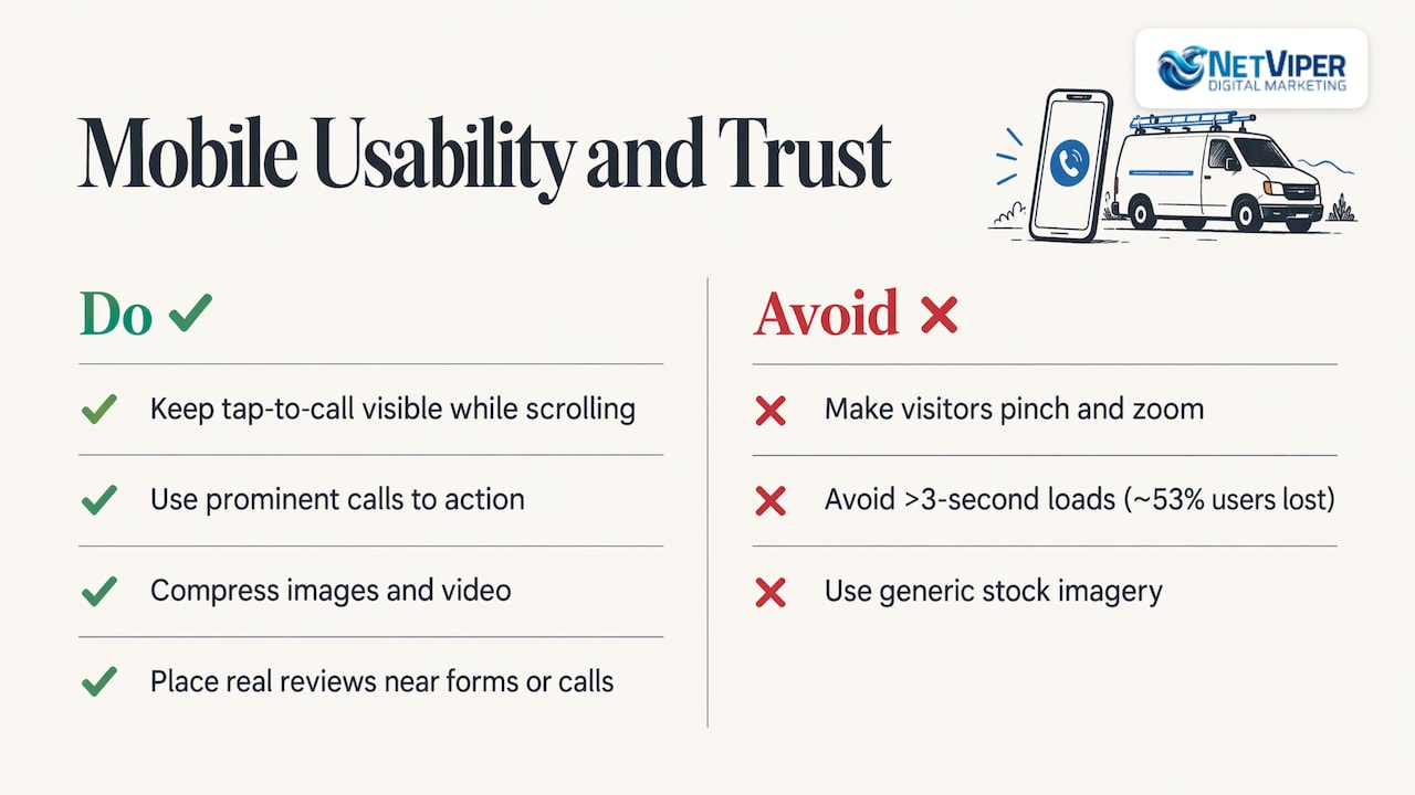
For most local searches, your first impression happens on a phone, often in a hurry. Someone with a burst pipe or a broken window is not going to pinch and zoom.
Mobile layout. Google’s research on mobile site design recommends prominent calls to action, click-to-call for complex or sensitive tasks, the simplest input method and clearly labeled fields, with real-time error validation and minimal form effort. For a service business, a tap-to-call button that stays visible as the visitor scrolls is often the highest-value element on the page.
Speed. A peer-reviewed methodological paper reports that a mobile site taking longer than 3 seconds to load loses approximately 53% of its users. To keep pages quick, compress images and video, use browser caching and choose a reliable host, as Shopify’s guide recommends. To track progress, the U.S. Web Design System suggests following Speed Index, Time to Interactive and page weight.
Trust. Put real reviews, testimonials, credentials and security cues near the form or call button. Use genuine photos of your team and your work in place of generic stock imagery where you can, and show your address and service area plainly. These signals matter most to first-time visitors who do not know you yet.
What B2B and high-consideration sites need
If your customers are other businesses, or your service is a bigger purchase such as a remodel or a commercial contract, the buying cycle is longer. Nielsen Norman Group’s B2B usability research says these sites must generate leads and support complex buying processes, with compelling service pages, comparison information, proof of business benefits, clear contact options, forms and strong calls to action.
That changes the page plan. Instead of one “Contact us” button for everyone, offer a ladder of actions:
- A low-commitment step for early researchers, such as a checklist, a pricing overview or a short call.
- A direct step for ready buyers, such as a quote request or phone number.
- Detailed service pages that answer the questions a decision-maker will ask: what is included, how it works, what results to expect, who you have worked with.
Measure first, then test
Design opinions are cheap. Data is better. Before you redesign anything, make sure you can see what visitors do and which actions count as conversions.
- Set up conversion tracking. Track form submissions, calls, chat starts and bookings, and tie them to the traffic source. For ad-driven calls, call tracking shows which spend earns which call.
- Find the drop-off points. Funnel reports, heatmaps and session recordings reveal where visitors stall. A step with heavy abandonment is your first target.
- Watch real people. Usability testing shows problems analytics cannot explain. The Department of Energy’s usability guide notes that tests can measure task success rates and time on task. Asking five to eight target users to complete a task while thinking aloud is a common, lightweight format.
- Form a hypothesis. “Shortening the form from seven fields to three will increase submissions” is testable. “Make it better” is not.
- Test one change at a time. Run an A/B test long enough to reach statistical significance, commonly judged at a 95% confidence level, so you can tell real improvement from random variation. Low-traffic local sites often need longer test windows, or sequential before-and-after comparisons on bigger changes.
- Keep what wins, then repeat. Mailchimp describes the approach as relying on data-driven decisions that use behavioral insights to remove obstacles in the user journey, step by step.
If you are unsure whether your tracking is even capturing the right actions, a focused review of your setup usually pays for itself quickly. Our Conversion Tracking Audit is $175 per hour.
A practical checklist for your next site or redesign
Use this list as a first pass on your current pages:
- Headline: Does it say what you do, for whom, and where, within a few words?
- Primary action: Is there one clear next step, visible without scrolling, on desktop and mobile?
- Button wording: Does it tell the visitor exactly what happens when they click?
- Proof: Are reviews, credentials or results close to the action?
- Form: Could you remove a field? Are labels clear and errors handled instantly?
- Speed: Do pages load in under three seconds on a mobile connection?
- Message match: Does each ad or search listing lead to a page that repeats its promise?
- Tracking: Is every call, form and booking counted and attributed?
- Follow-up: When a lead arrives at 9 p.m., how soon does someone respond? Our guide on automated lead follow-up shows how to build a system that replies in minutes.
For campaign pages specifically, our landing page guide walks through the elements in more depth, and our landing page optimization service applies them to your existing pages.
Our perspective
We build websites for local business owners in Northeast Florida, and we see the same pattern again and again: a business invests in traffic, through Google Ads, local SEO or Facebook, and the website quietly wastes a share of it. The fix is rarely a prettier homepage. It is a clearer promise, a faster page, a shorter form and a response that arrives while the customer is still interested.
That is why we treat the website, the ads and the follow-up as one system. A conversion-focused site gives your paid and organic traffic somewhere useful to land. Strategic local SEO and Google Business Profile work bring the right people to it. Conversion tracking tells you which of those efforts actually produce calls and bookings. And our AI tools, such as chatbots and voice agents, are designed to make sure a lead is answered even when your team is busy or closed.
Our Smart Website approach is built for lead capture and appointment booking, with certified specialists in Google Ads and conversion optimization behind the strategy. Because we work with local businesses here in Northeast Florida, we design around how your customers in Jacksonville, St. Johns County and St. Augustine actually search and decide. Start with the goal, measure what happens, and improve it every month.
Dave Fogel
Put it to work with a Smart Website
If you want a site designed around leads from the first sketch, our Smart Website design combines clear conversion paths with lead capture and appointment booking. We publish no set price for website projects, because scope depends on your pages, integrations and goals. You can also see how it fits with ads, SEO and automation on our digital marketing pricing page, where the Full Digital Program is $1,995 per month plus a one-time set-up fee of $2,500.
If your traffic already comes from search or ads, pairing the new site with Google Ads management means the pages and the campaigns are planned together, so each click lands on a page written for it. If you want to sharpen your own team’s skills first, Paid Ads Coaching is $225 per hour.
FAQ
What is a conversion-focused website?
It is a website designed to guide visitors toward a specific business action, such as a call, a booking or a purchase. Layout, copy, navigation and forms are all arranged to make that action clear and easy. Aesthetics support the goal rather than compete with it.
What counts as a conversion in web design?
A conversion is any completed action that has value to your business. For local companies that usually means a phone call, a form submission, a chat conversation, an appointment booking or a purchase. Define yours before you design, then track each one so you can see which pages and campaigns produce it.
Does a conversion-focused design mean the site has to look plain?
No. Good visual design builds credibility and helps visitors understand your offer. The difference is that each visual choice has to support the goal. Baymard’s definition of conversion design puts the business goal ahead of decoration, not in place of good looks.
How long should a form be?
Ask only for what you need to respond, which for many local services is a name, a phone number or email, and a short description of the need. Adobe’s advertising guidance recommends requesting only necessary information. If you must collect more, split the form into steps with a progress indicator.
How do I know if my website redesign worked?
Compare conversion rate and lead volume by traffic source before and after the change, using the same definitions of a conversion. Add usability testing to understand why numbers moved. When you run A/B tests, wait for enough data to reach statistical significance before declaring a winner.
Sources
- Conversion Design: the Real Purpose of Web Design (Baymard Institute)
- Conversion-Centered Design Explained and How To Apply It (Shopify)
- Conversion-centered design: 7 essential principles (Webflow)
- Conversion Focused Web Design: A Detailed Guide (VWO)
- Optimize the website landing pages (Adobe Advertising)
- “Get Started” Stops Users (Nielsen Norman Group)
- Better Link Labels: 4Ss for Encouraging Clicks (Nielsen Norman Group)
- The Illusion of Completeness (Nielsen Norman Group)
- Principles of Mobile Site Design (Think with Google)
- Methodological Guidelines for Systematic Assessments (PMC)
- How to track performance (U.S. Web Design System)
- Guide to Usability and Analysis Techniques (U.S. Department of Energy)
- GA4 Evaluation (Varify.io)
- Tips for Successful Conversion-Centered Design (Mailchimp)
Recommended

Google Ads Not Converting? How to Find and Fix the Cause
Getting clicks but no leads from Google Ads? Check tracking, wait times, search terms, targeting and landing pages in order to find what is costing you conversions.
Local Facebook Advertising: How to Reach Nearby Customers
Learn how local Facebook advertising works: location targeting, objectives, retargeting website visitors, measurement and privacy basics for local business owners.

Conversion-Focused Web Design for Local Businesses
Learn what conversion-focused web design is, the principles behind it, and how local businesses can turn more website visitors into calls, bookings and leads.
