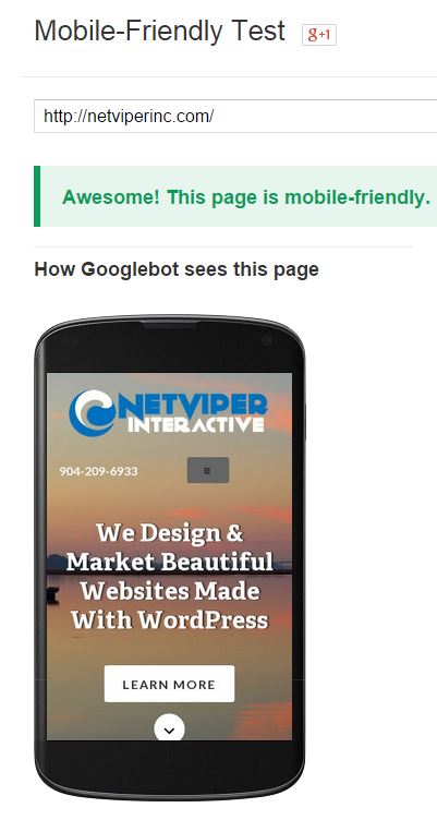 Making sure your website is mobile friendly is now more important than ever. But how can you be sure you are mobile friendly? Google has created a testing tool so you can test for yourself. It is pretty simple to use. Just type your website into the tool and see what happens.
If your mobile pages use different URLs than your desktop pages (such as m.example.com or example.com/m/), test both mobile and desktop URLs in Fetch as Google to make sure that redirects are correct. .
If all looks good, then move on to ensure your mobile site passes the mobile testing tool.
Go ahead and try it yourself. If you fail, there are some different things you can try. Contact us to learn more.
Testing out DISQUS
I am testing out the DISQUS (pronounced DISCUSS) commenting system for WordPress.
Converting a site to WordPress
So over the last two week, I have spend my free time converting my site over to WordPress. There are several reasons for this. First, I really like the ability to add plug-ins to my site. I also love how easy it is to add new pages and manage the site. There are also the…
Ten tips for passing the new Google Advertising Fundamentals Exam
So, you have decided that it is time to finally take the test. What you might not know is that Google JUST changed over to a brand new test. Gone are the days of testing through Prometric. Google now has you download a browser to use that you must take the test with. Now, I…