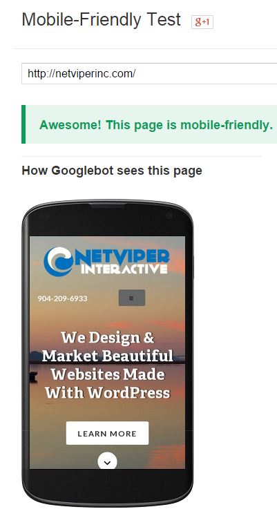 Making sure your website is mobile friendly is now more important than ever. But how can you be sure you are mobile friendly? Google has created a testing tool so you can test for yourself. It is pretty simple to use. Just type your website into the tool and see what happens.
If your mobile pages use different URLs than your desktop pages (such as m.example.com or example.com/m/), test both mobile and desktop URLs in Fetch as Google to make sure that redirects are correct. .
If all looks good, then move on to ensure your mobile site passes the mobile testing tool.
Go ahead and try it yourself. If you fail, there are some different things you can try. Contact us to learn more.
Clearing Input Forms with Contact Form 7
Many websites today will not have labels next to their input boxes anymore. Instead they place the text inside the input box. Contact Form 7 plug in can do this out of the box, but the user has to erase what is in the box before they can type in their information. This is a)…
Site Updates
I did some new updates to the site today. This included adding some new images to the web design gallery, updating some homepage content and adding our contact info to the header. The site will be going through a total redesign in the near future when we have some time to work on it. Right…
Testing FireFox 4 beta
So I have spent a little bit of time testing the firefox 4.0 beta. So far I really like it. It is very fast and seems to work much better than 3.6. I am looking forward to trying it with more plugins as they become available.