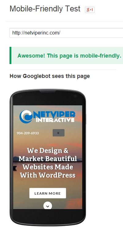 Making sure your website is mobile friendly is now more important than ever. But how can you be sure you are mobile friendly? Google has created a testing tool so you can test for yourself. It is pretty simple to use. Just type your website into the tool and see what happens.
If your mobile pages use different URLs than your desktop pages (such as m.example.com or example.com/m/), test both mobile and desktop URLs in Fetch as Google to make sure that redirects are correct. .
If all looks good, then move on to ensure your mobile site passes the mobile testing tool.
Go ahead and try it yourself. If you fail, there are some different things you can try. Contact us to learn more.
The Jacksonville SEO Company For Your Business
Looking for a Jacksonville SEO Company? You have come to the right place. We have put together some helpful information about SEO that will hopefully answer some of the most common questions about SEO. What is SEO? An SEO (Search Engine Optimization) company helps businesses improve their visibility on search engines like Google, Bing, and…
What Are The Most Popular Facebook Ad Sizes?
The most popular Facebook ad sizes are: 1200 x 628 pixels (1.9:1 aspect ratio): This size is recommended for most types of ads, including single image, carousel, and video ads. 1080 x 1080 pixels (1:1 aspect ratio): This square size is recommended for image and video ads that will be displayed in the news feed.…
Where Do Facebook Ads & Instagram Ads Appear?
Facebook ads appear in a variety of places across the platform, including in the newsfeed, on the sidebar, and in Marketplace. In the newsfeed, ads are displayed alongside other posts from friends, family, and pages that have been liked. Ads are also displayed on the sidebar, where they appear alongside other suggested pages and posts.…