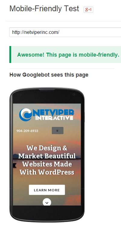 Making sure your website is mobile friendly is now more important than ever. But how can you be sure you are mobile friendly? Google has created a testing tool so you can test for yourself. It is pretty simple to use. Just type your website into the tool and see what happens.
If your mobile pages use different URLs than your desktop pages (such as m.example.com or example.com/m/), test both mobile and desktop URLs in Fetch as Google to make sure that redirects are correct. .
If all looks good, then move on to ensure your mobile site passes the mobile testing tool.
Go ahead and try it yourself. If you fail, there are some different things you can try. Contact us to learn more.
Setting up Rel Author
We might be a little late on this one, but it is worth setting up your rel author tags on Google plus. Google is very much looking at this type of information for rankings now, so it makes sense to get it done. There are several places to learn how to do this. Here is…
Adding A Featured Image To A Page In Genesis
After looking around the web for a good tutorial, I really couldn’t find what that accomplished what I was looking to do. It sounds simple. I want to add a featured image to a page in Genesis. No problem right? Not exactly. Genesis doesn’t work like a normal wordpress site, but then if you are…
Disable Auto Format in wordpress
This is a great trick I found today while working on a problem for a client. What was happening is that wordpress was wrapping her image in paragraph tags and causing it not to float right with text wrapping around it. The solution was to add this to the functions.php file. (note, make sure you…