 Making sure your website is mobile friendly is now more important than ever. But how can you be sure you are mobile friendly? Google has created a testing tool so you can test for yourself. It is pretty simple to use. Just type your website into the tool and see what happens.
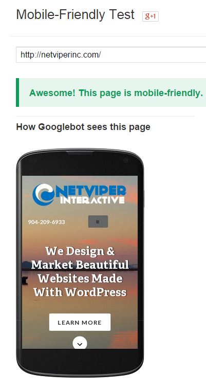
If your mobile pages use different URLs than your desktop pages (such as m.example.com or example.com/m/), test both mobile and desktop URLs in Fetch as Google to make sure that redirects are correct. .
If all looks good, then move on to ensure your mobile site passes the mobile testing tool.
Go ahead and try it yourself. If you fail, there are some different things you can try. Contact us to learn more.
Adding An Animated Icon To Genesis Responsive Menu
In this tutorial, we are going to be adding an animated icon and a responsive menu to the genesis starter theme from combining two different sources. For the responsive menu, we are going to be using the Genesis Responsive Menu 2.0 created by Ozzy Rodriguez. The full tutorial is located here. You can download the…
What Does Your Website Say About Your Business
OK, let’s get this out of the way first – I might be a little biased since I build websites in St. Augustine and Jacksonville for a living. Now that that is out of the way let’s talk about websites. For me, a website is a reflection of your business, just like your storefront or…
Advantages of working with a St. Augustine Web Designer
Yes, I realize you can work with anyone all over the world when it comes to finding someone to build your website. Some people really like the idea of working with someone from India, mainly because they get their website for a fraction of what it costs to use someone in the USA. But when…